
Obsessed with Smooth Blending? Here’s what you’re missing
Alcohol markers and blending. They go together, right?
Which is kinda sad.
But think about it, what’s the first thing you learned to do with alcohol markers?
Blending.
What are most marker classes, free videos, and tutorials about?
Blending.
And what’s the last you did with a marker?
Yep, you get the picture.
Blending can be beautiful but it also makes everything look zzzzzzzz….
Blending is fun but smooth blending often looks empty or unfinished.
Wanna know why?
Just look around you.
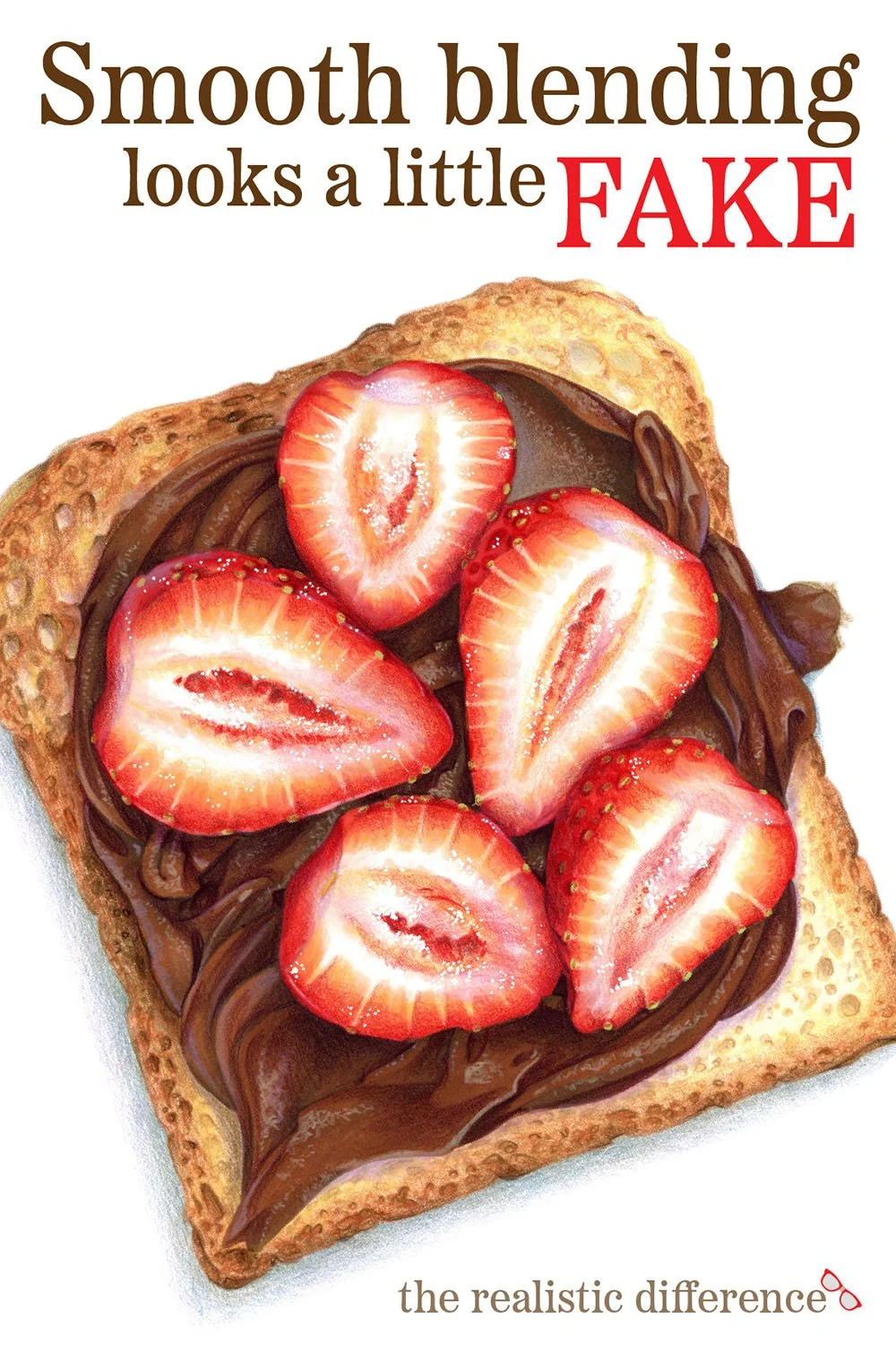
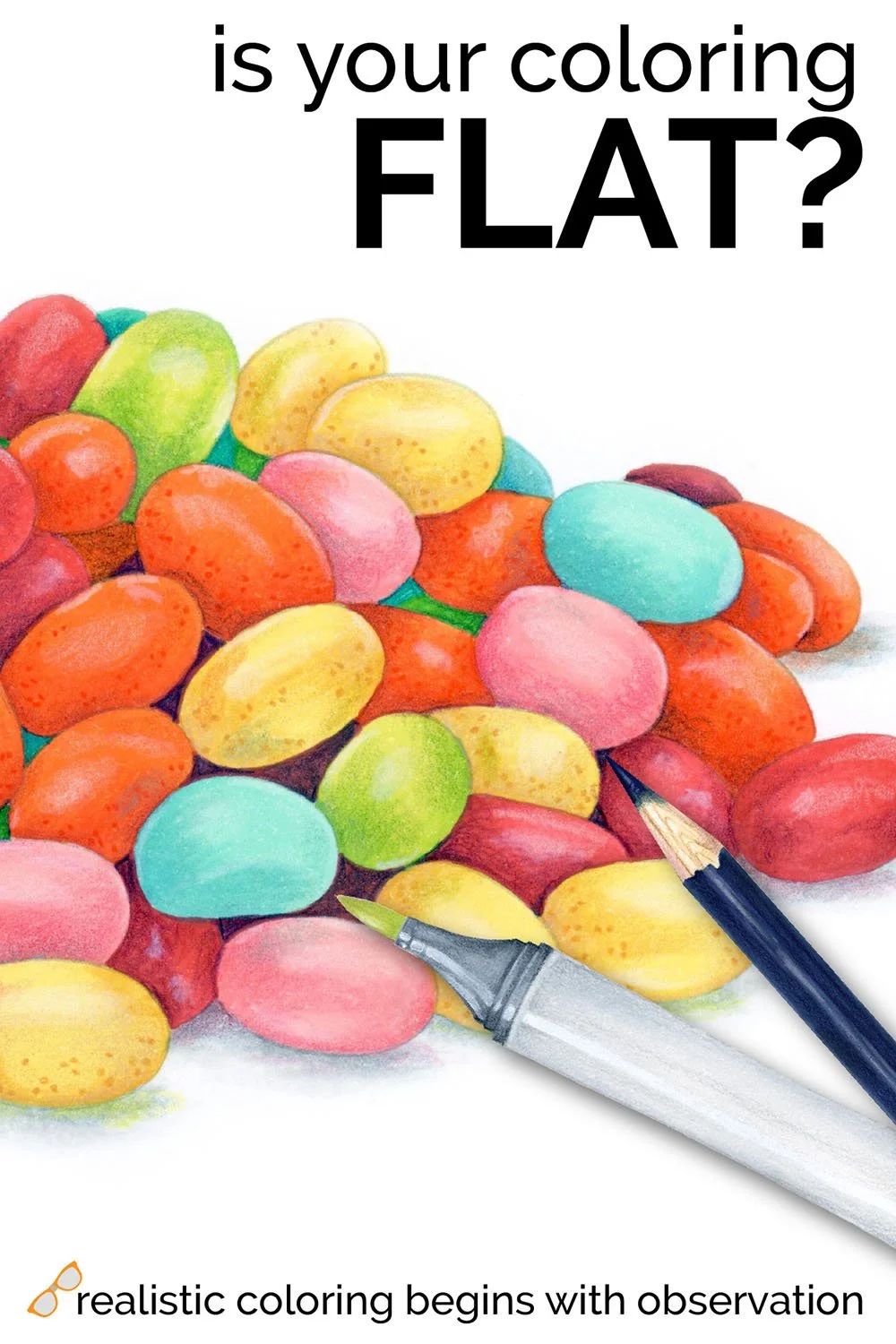
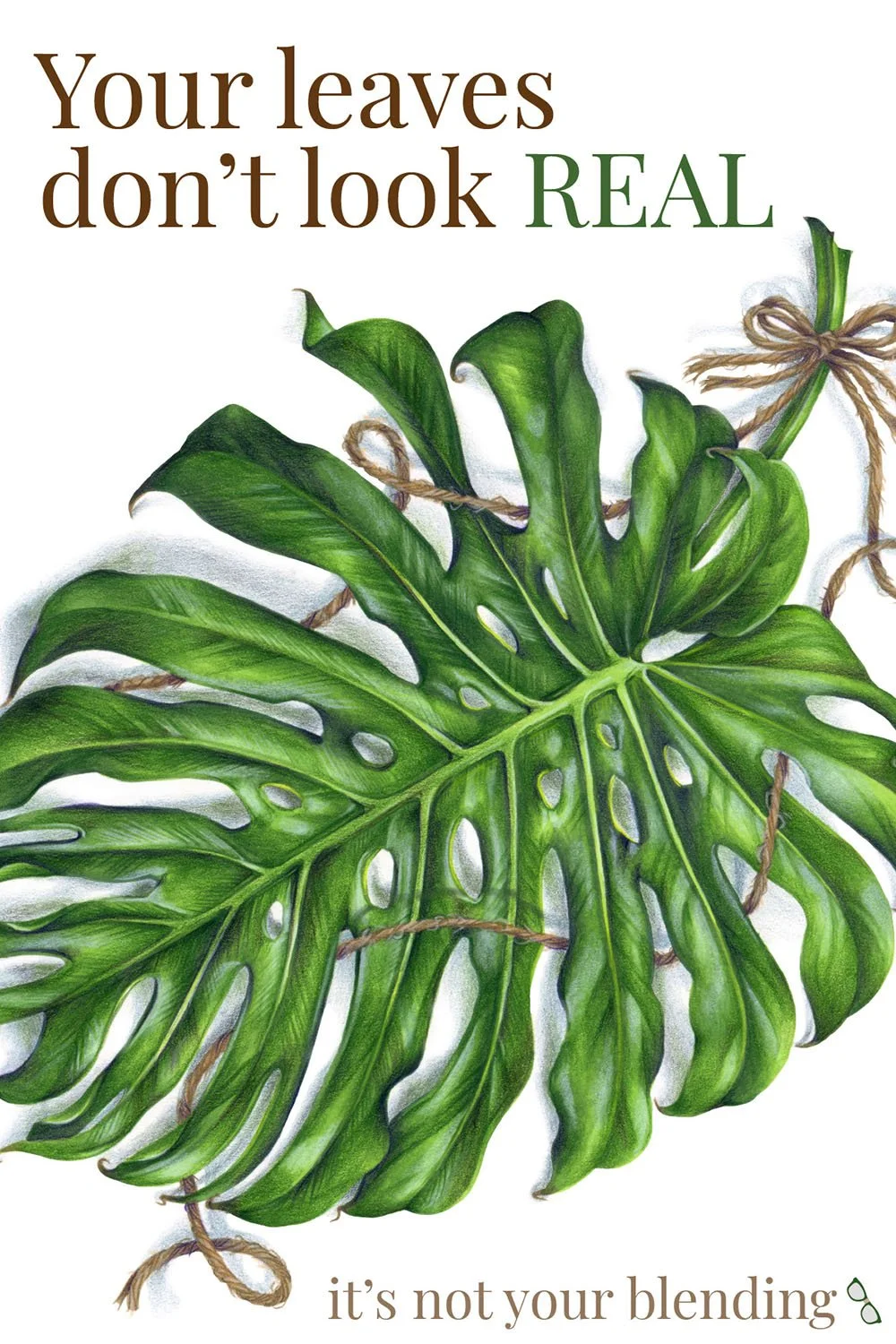
SMOOTH MARKER BLENDING is what’s called a “fill technique”. Fills cover large areas with even, streak-free color. But fills are a base coat. Somewhere along the way, colorists lost the final finish layers of texture.
Let’s Change Our Approach:
To color with realism, first look around you.
Unless you live in a Barbie Dream House, your world is not plastic. Everything around you has a unique texture and surface quality.
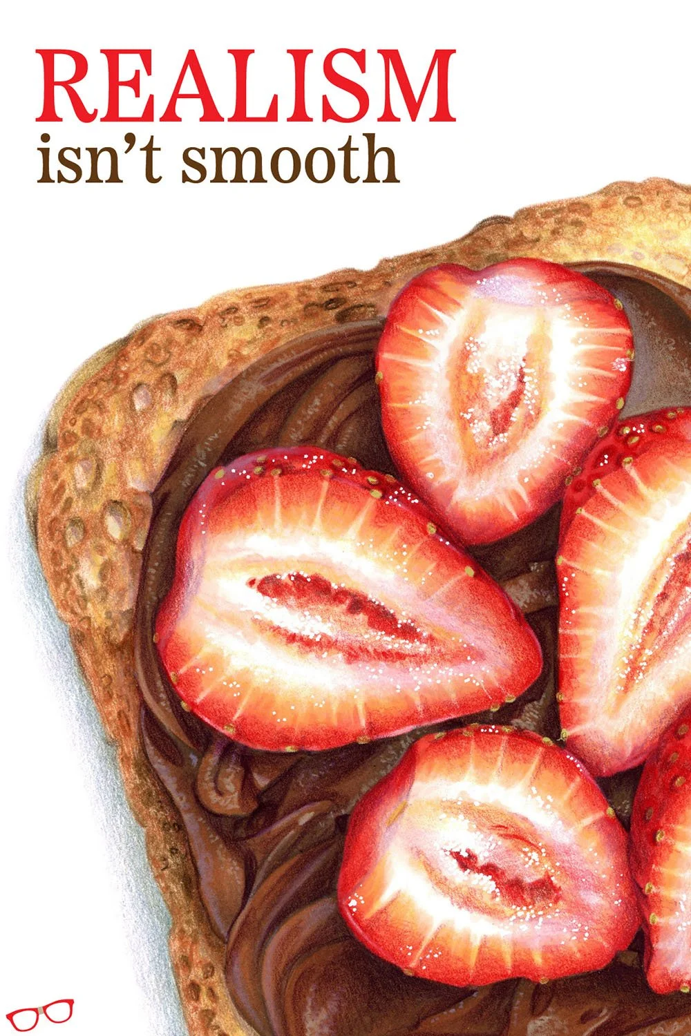
Real realism requires real texture.
And that’s ultimately the artist’s job— show us what something feels like.
Why It Works:
Texture adds instant realism to your coloring because we identify everyday objects based on their texture.
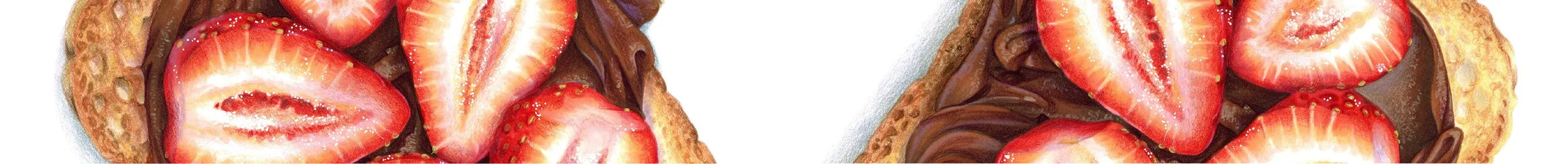
Is this a slice of toast with strawberries or is it a doggie chew toy?
Texture tells us.
Don’t skip the texture just because blending seems easier.
The vast majority of students come to me seeking help smoothing-out their bad blending technique. It can take weeks to resolve some blending issues.
Guess which techniques everyone masters almost immediately? Pointillism. Overlapping strokes. Circular fills. Scumbling.
Texture strokes are easier than blending because nobody has outrageously high expectations for creative scribbling.
Blending perfectionism kills the joy of coloring, meanwhile texture can be anything you want it to be.
Supplies used in Strawberry Toast
Copic Alcohol Markers
Prismacolor Premier & Derwent Lightfast Colored Pencils
Smooth Bristol Board
Full supply list with specific colors at the bottom of this page.
Today’s article was just a quick tip, giving you permission to ditch the obsessively smooth blending.
Live a little, play a little. Add some texture.
In the Strawberry Workshop inside ColorWonk, we delve deep into some of my favorite ways to visualize texture and then color what we see.
Blending looks pretty, but it doesn’t feel real.
And the best part? This workshop isn’t just about strawberries or toast or hazelnut spread...
Wait, did someone say hazelnut spread?
Once you understand how artists develop their own unique style of mark-making and texture, coloring becomes so much easier!

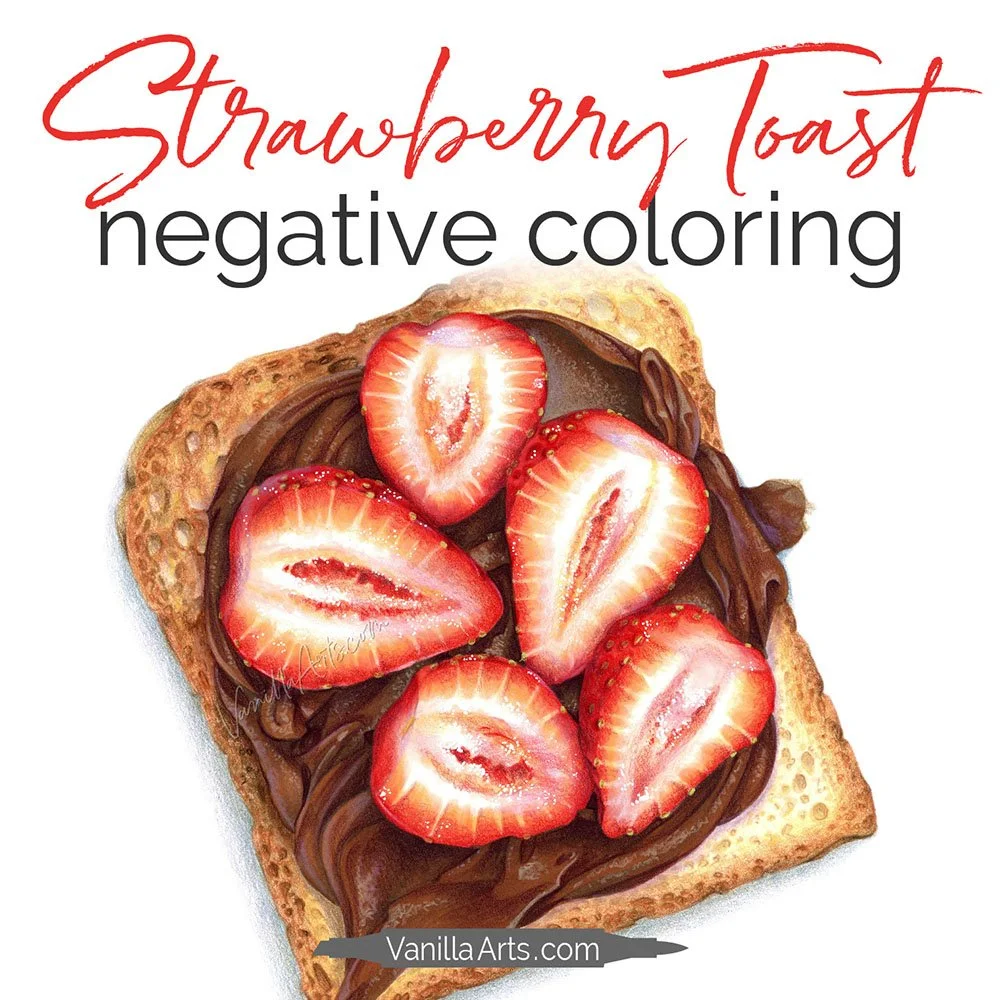
Strawberry Toast is one of my signature workshops here at ColorWonk
ColorWonk is a monthly membership for colorists and shy artists who want to improve realism, artistic observation, and color confidence through workshops, livestreams, and a growing library of artistic education.
It’s like art school for coloring!
If you enjoy this deeper way of thinking about color, you’ll feel right at home inside ColorWonk.
New to ColorWonk? Learn how membership works.
Not ready for classes yet?
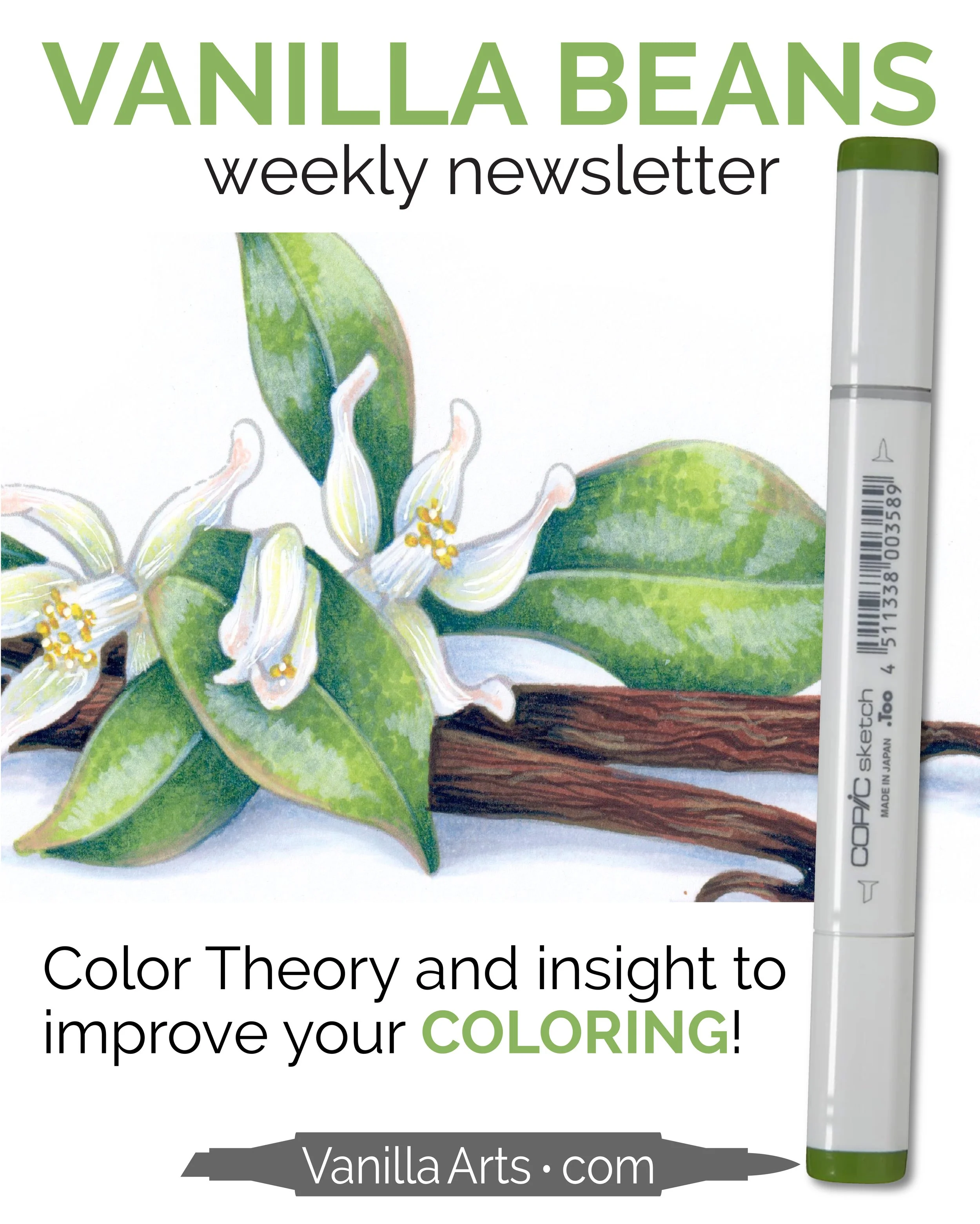
Every Saturday, I send a free color theory lesson designed to help adult colorists better understand why some coloring techniques work while others fail miserably.
It’s a simple way to improve your coloring while getting to know me and my Color Wonky style.
Get your FREE subscription to the Vanilla Beans Newsletter here and I’ll see you on Saturday!
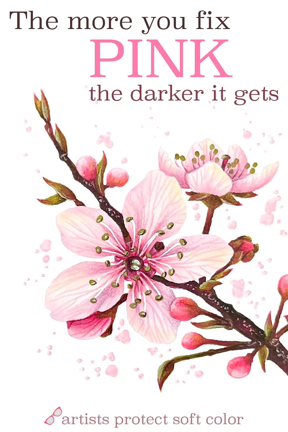
Related Articles:
(click to read)
Supplies Used in Strawberry Toast:
