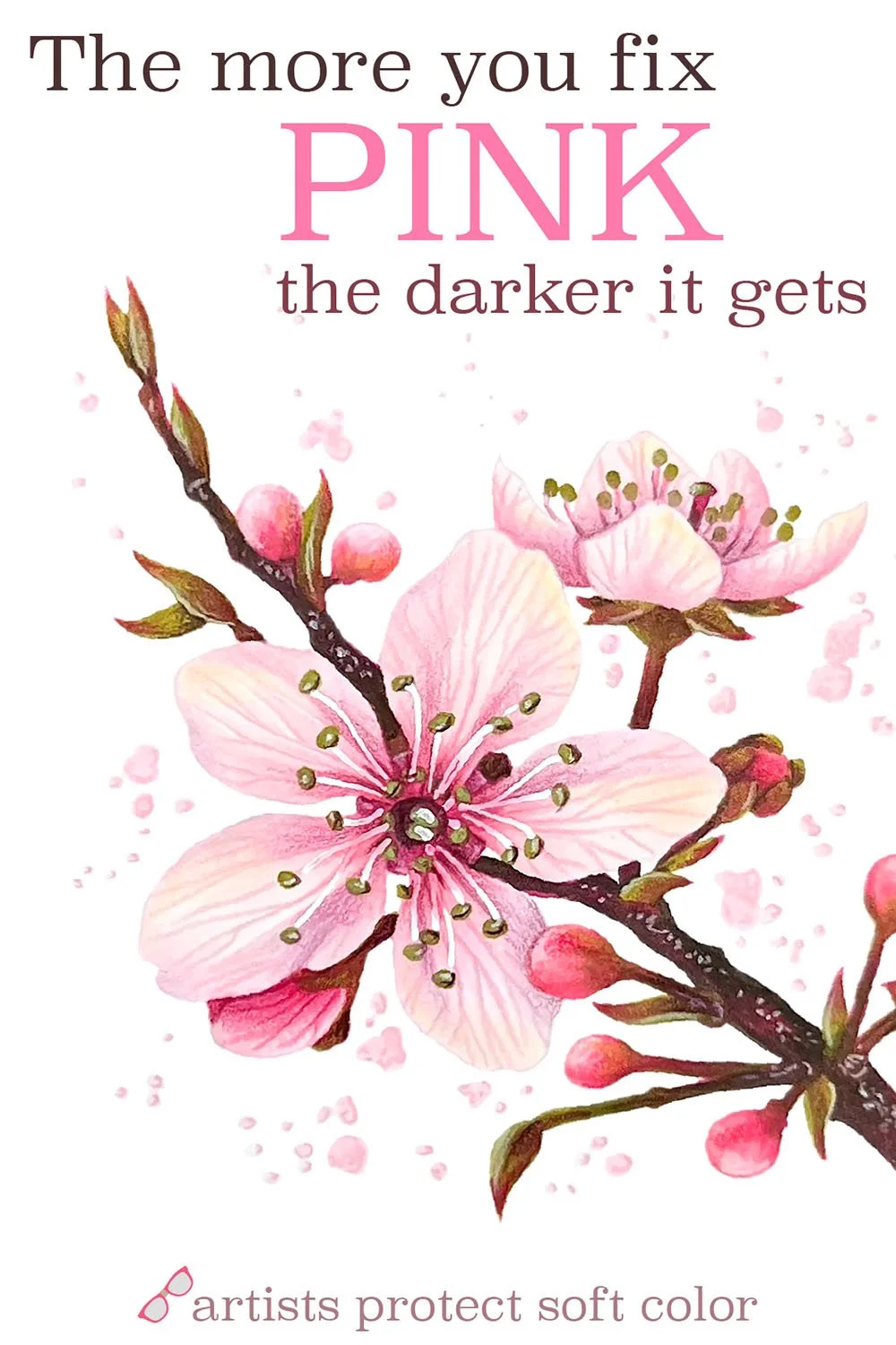
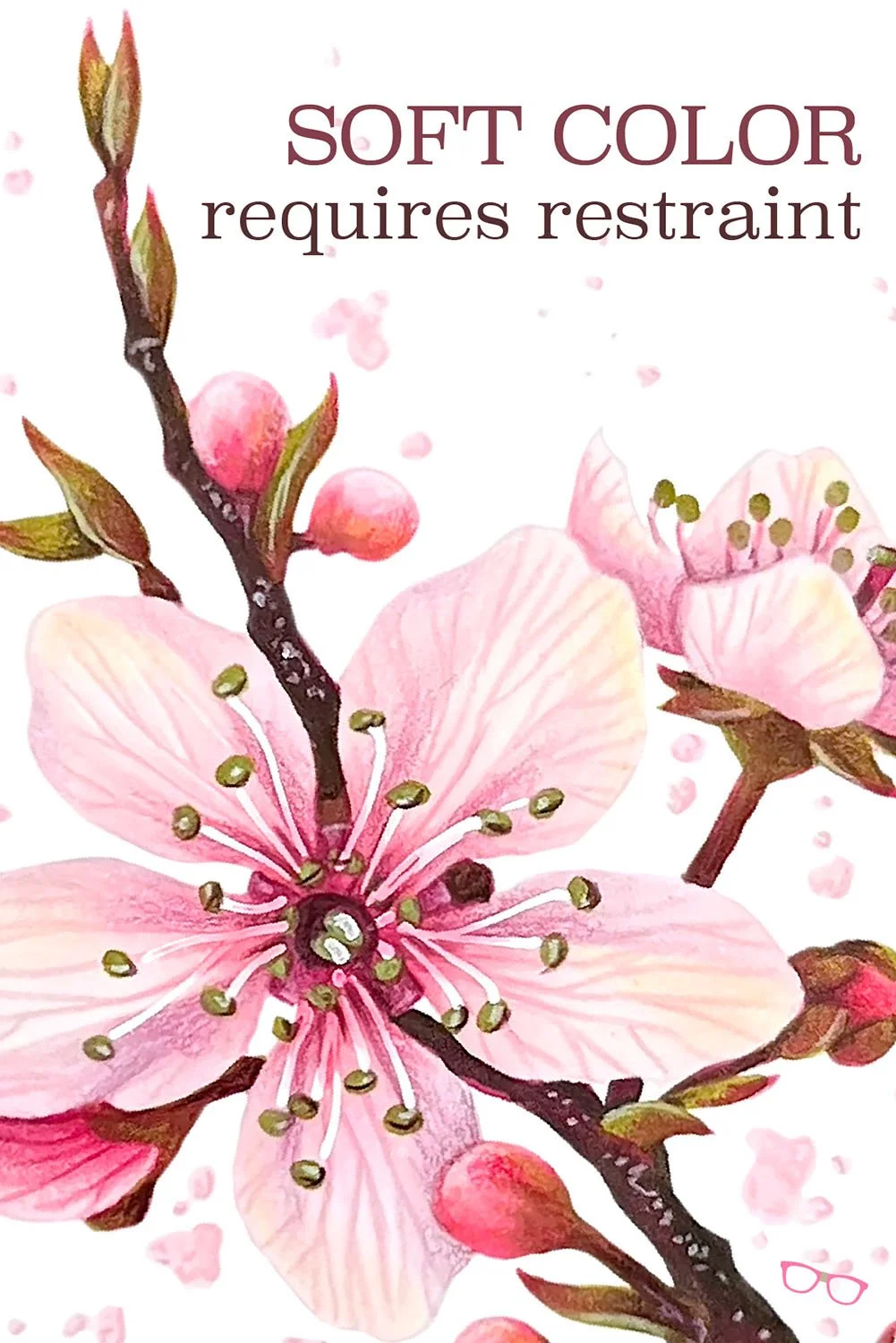
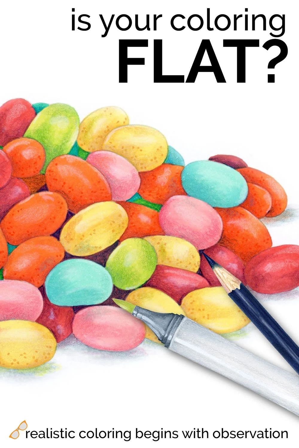
The More You Fix Pink, The Darker It Gets
You choose the palest markers you own and yet your coloring looks bold and bright…
… Should buy a bunch of super-duper light markers?
Stop. You’re trying to buy your way to a solution. The reason your light markers look dark isn’t the color of the marker, it’s the way you’re applying the ink.
Adult coloring encourages perfectionism— even if you’re not picky in other areas of your life, you still want your coloring to look neat and tidy.
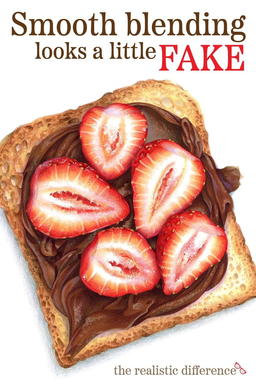
The blend doesn’t look as smooth as you want, so you add another layer. The edges look a bit ragged, so you add another layer. You want a bit more shade, so you add another layer.
Hang on, all these layers are accidentally creating a darker color!
ALCOHOL MARKERS are made with transparent ink. Every layer quietly builds on the one before it. Buildable color adds more saturation, depth, and darkness with each pass.
Let’s Change Our Approach:
Your natural instinct is to slow down when you’re fixing a mistake.
You went too fast the first time and look at what happened. Let’s be more careful, right?
But slow strokes apply more ink to the paper AND you’re adding extra layers to mask mistakes.
It’s a perfect storm, turning your palest pinks into a hot pink disco party!
Professional marker artists tend to color much faster than the average colorist. That’s actually the number one comment people make when they watch me color live in person for the first time.
“Dang, she’s really fast!”
Why It Works:
Coloring fast solves two problems— first, my marker spends very little time touching the paper. Less contact means less ink volume per stroke.
But the odd benefit to coloring like the wind is that I generally don’t even notice I’ve made a mistake until the project is almost done. And honestly?
Most marker mistakes will fix themself without any help from you.
The longer you linger over your coloring, the darker it gets.
It’s simple math. More layers = more color.
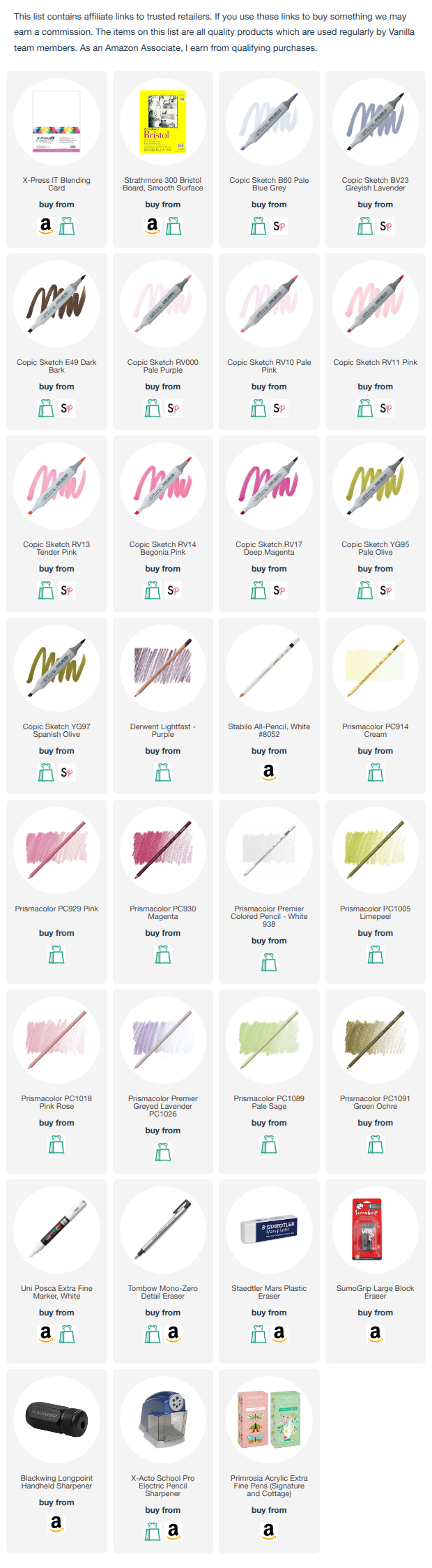
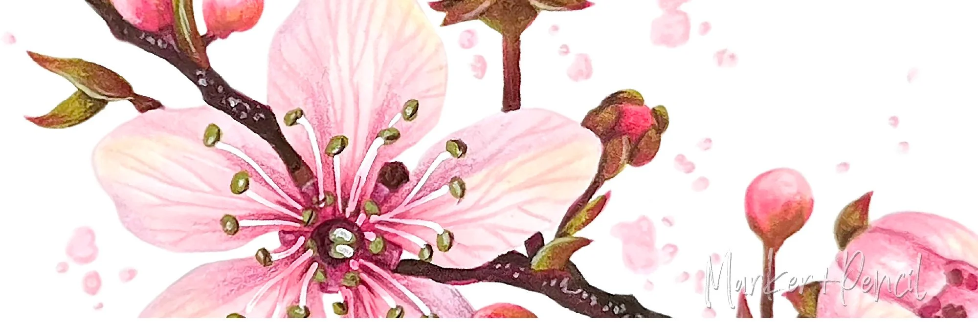
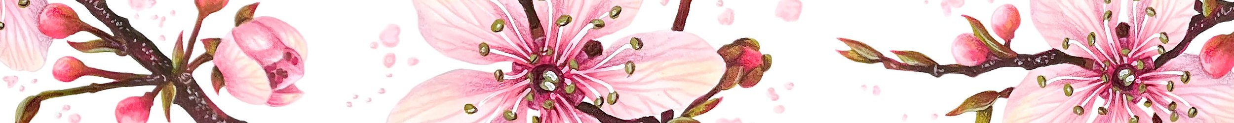
Supplies used in “Cherry Blossom”
Copic Alcohol Markers
Prismacolor Premier & Derwent Lightfast Colored Pencils
Smooth Bristol Board
Full supply list with specific colors at the bottom of this page.
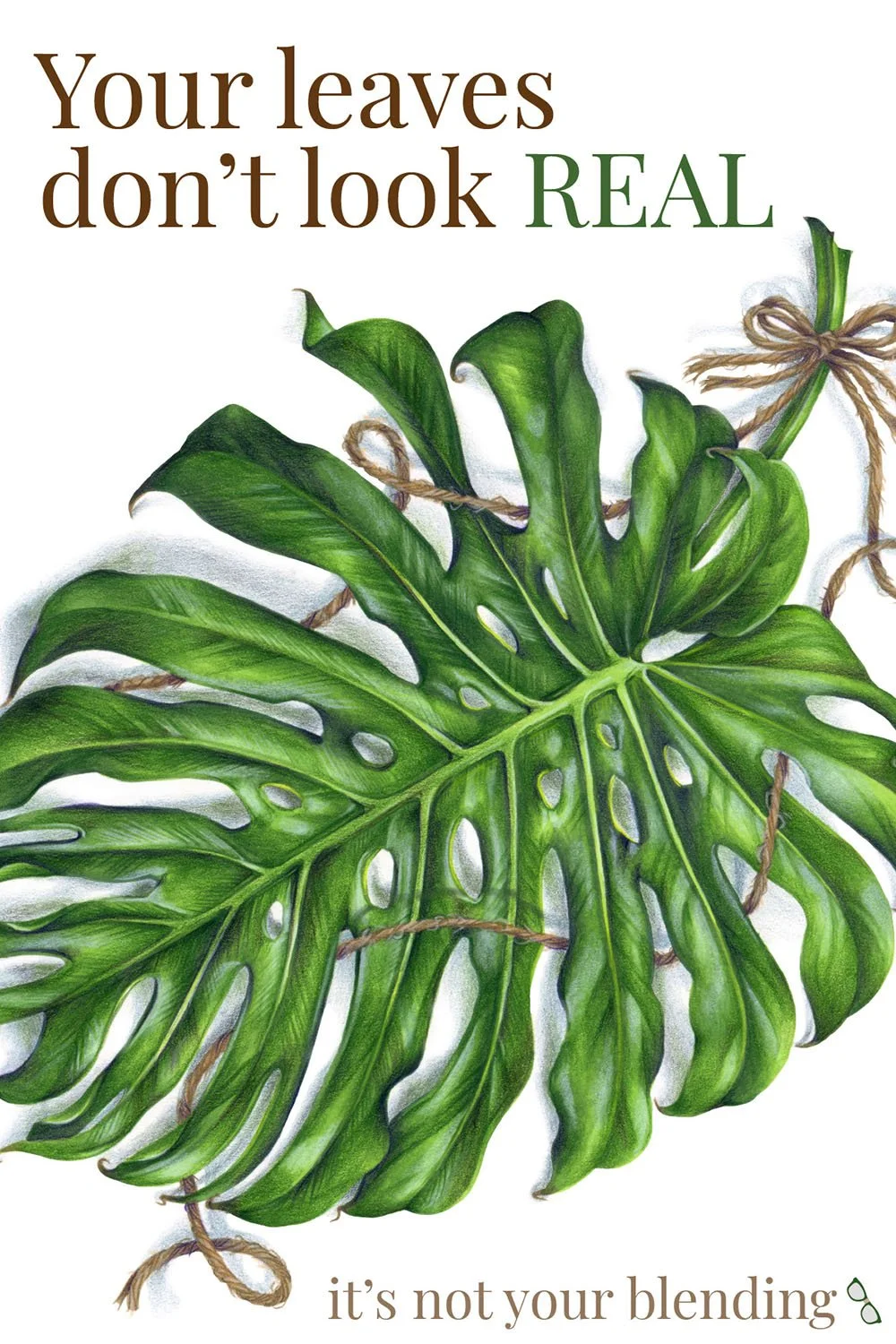
Today’s article was just a quick tip, but this problem happens with every color— it’s just the most obvious with soft and barely-there colors.
In the Cherry Blossom Workshop inside ColorWonk, we go deeper into the color theory behind pink, including how to make pink feel sweeter, brighter, moody, or sophisticated.
Cherry blossom pink may look effortless, but soft color takes intentional control.
And the best part? This workshop isn’t just about pink or just about flowers.
Once you understand how artists support and preserve pale colors, you can create the exact mood and softness you want in any project.

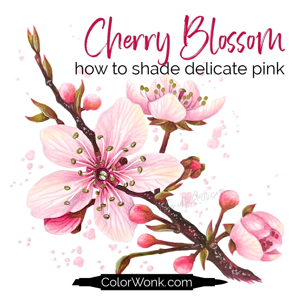
Cherry Blossom is one of my signature workshops here at ColorWonk
ColorWonk is a monthly membership for colorists and shy artists who want to improve realism, artistic observation, and color confidence through workshops, livestreams, and a growing library of artistic education.
It’s like art school for coloring!
If you enjoy this deeper way of thinking about color, you’ll feel right at home inside ColorWonk.
New to ColorWonk? Learn how membership works.
Not ready for classes yet?
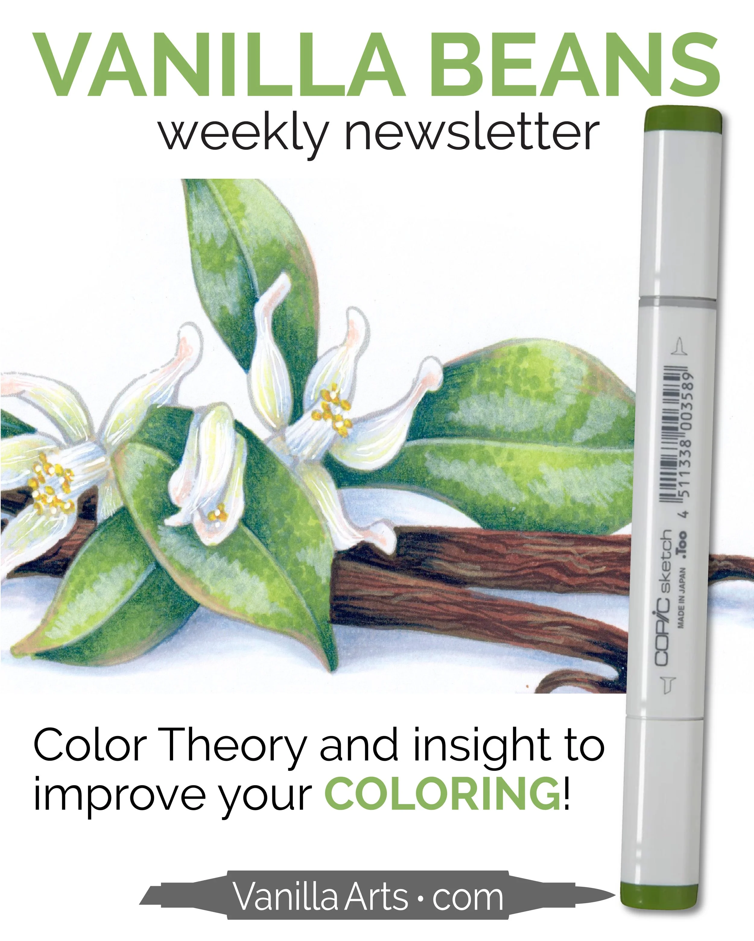
Every Saturday, I send a free color theory lesson designed to help adult colorists better understand why some coloring techniques work while others fail miserably.
It’s a simple way to improve your coloring while getting to know me and my Color Wonky style.
Get your FREE subscription to the Vanilla Beans Newsletter here and I’ll see you on Saturday!
Related Articles:
(click to read)
Supplies Used in Cherry Blossom: